Zodiac War

Project Overview
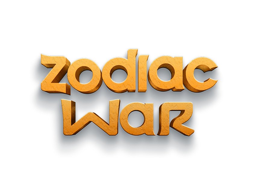
The Zodiac War logo was designed to reflect the essence of the game: a strategy-driven, action-packed battle between zodiac-themed entities. The typography, texture, and color palette were carefully chosen to create a visually striking identity that embodies the game’s theme of cosmic warfare and mysticism.
Design Goals
- Bold & Readable: The typography needed to be strong and eye-catching, ensuring clarity across different mediums such as game covers, UI elements, and promotional materials.
- Cosmic & Mythological Feel: Since the game is themed around zodiac signs, the design had to evoke a sense of mythology, ancient symbols, and astrological power.
- Tactile & 3D Appearance: A textured, stone-like material gives the logo a sense of permanence and strength, making it feel legendary and immersive.
- Dark & Mysterious Background: The deep black/blue background contrasts with the golden hues, enhancing readability and adding a sense of mystery and depth.
Design Process
- Concept Exploration
- Initial sketches focused on different typographic styles, from ancient calligraphy to futuristic and fantasy-inspired lettering.
- Experimented with various zodiac-inspired symbols, but opted for a minimalist approach to let the typography shine.
- Typography Selection
- A custom-designed font was used to create a unique, battle-ready feel.
- Rounded yet strong edges give a mix of playfulness and power, making it suitable for a game that blends action and strategy.
- Texture & Effects
- A stone-like texture was applied to give the letters a chiseled, ancient feel, evoking the idea of zodiac symbols carved into celestial monuments.
- Shadows and highlights add depth, making the logo feel more dynamic and three-dimensional.
- Color Palette
- The warm golden hues symbolize power, energy, and an ancient, mystical force.
- The dark background enhances contrast, making the letters pop while conveying an element of space, night, and the cosmic unknown.
- Final Adjustments & Polish
- Fine-tuned the shadows and lighting to ensure depth and readability across different formats.
- Tested different backgrounds to ensure versatility in marketing materials, UI elements, and in-game branding.
Challenges & Solutions
- Balancing Readability & Aesthetic:
The initial designs had more intricate details, but some reduced readability. The final version simplifies elements while keeping an impactful look. - Ensuring Versatility:
The logo needed to work across multiple platforms (game UI, website, merchandise, trailers). A dark background was chosen for flexibility while allowing variations for different uses. - Creating a Distinct Identity:
Many fantasy and strategy games use medieval or sci-fi fonts. By focusing on a unique stone-carved look, Zodiac War distinguishes itself while maintaining a timeless appeal.
Outcome & Impact
The final Zodiac War logo successfully conveys the game’s theme while maintaining strong visual appeal. The design aligns with the narrative of an epic cosmic battle, making it an effective and memorable brand identity. It stands out in the competitive game market, ensuring that Zodiac War is instantly recognizable.
