“Quikeat” – Food Ordering App
Branding and Design of a Food Ordering App
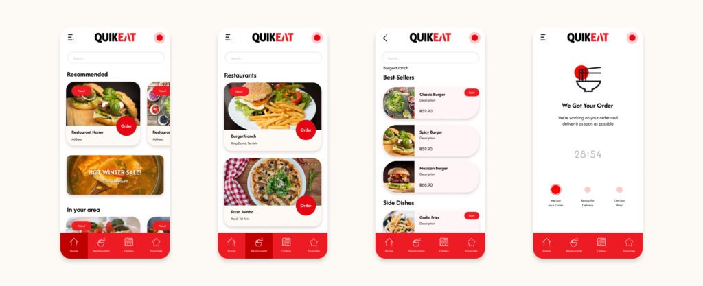
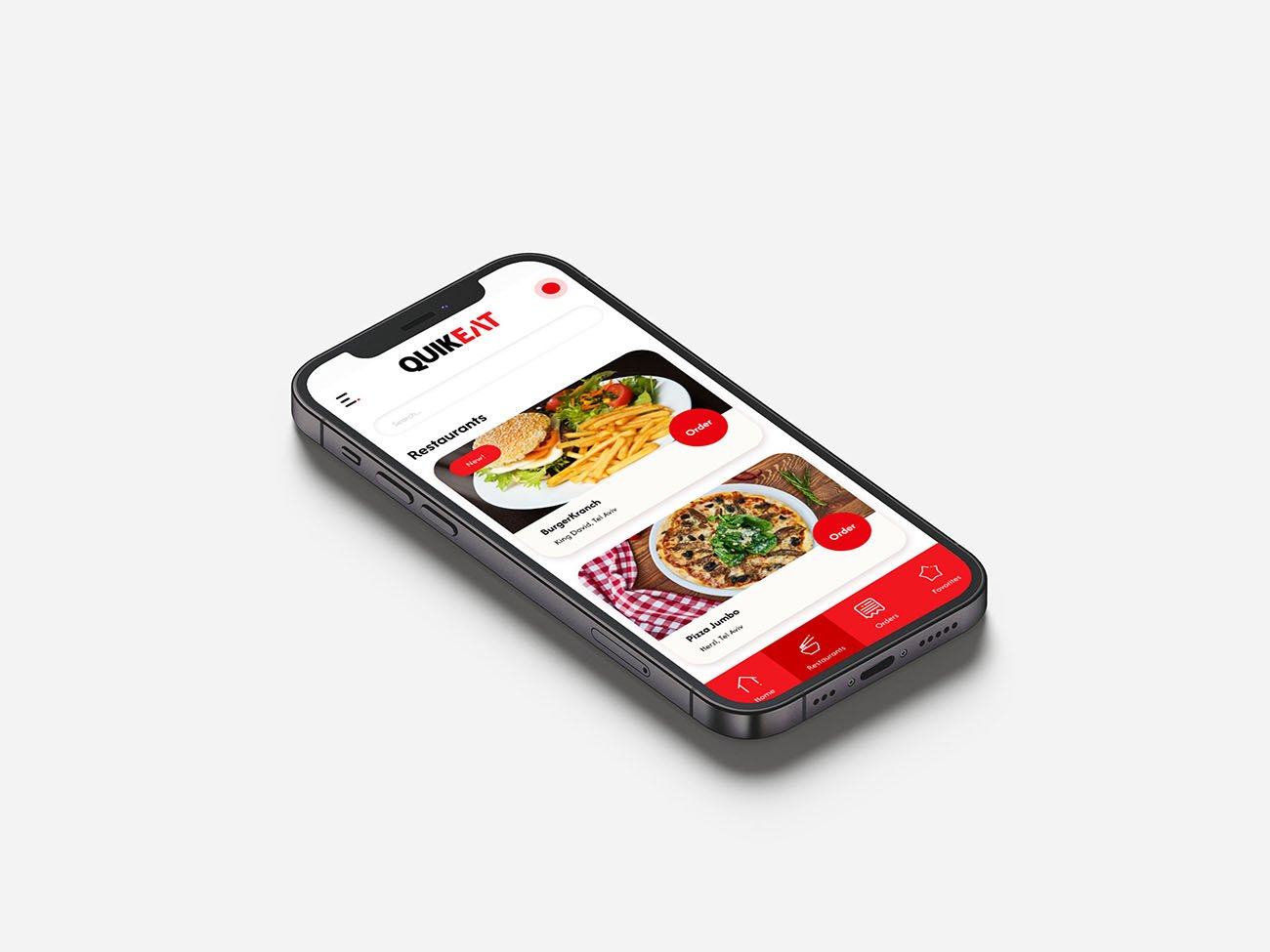
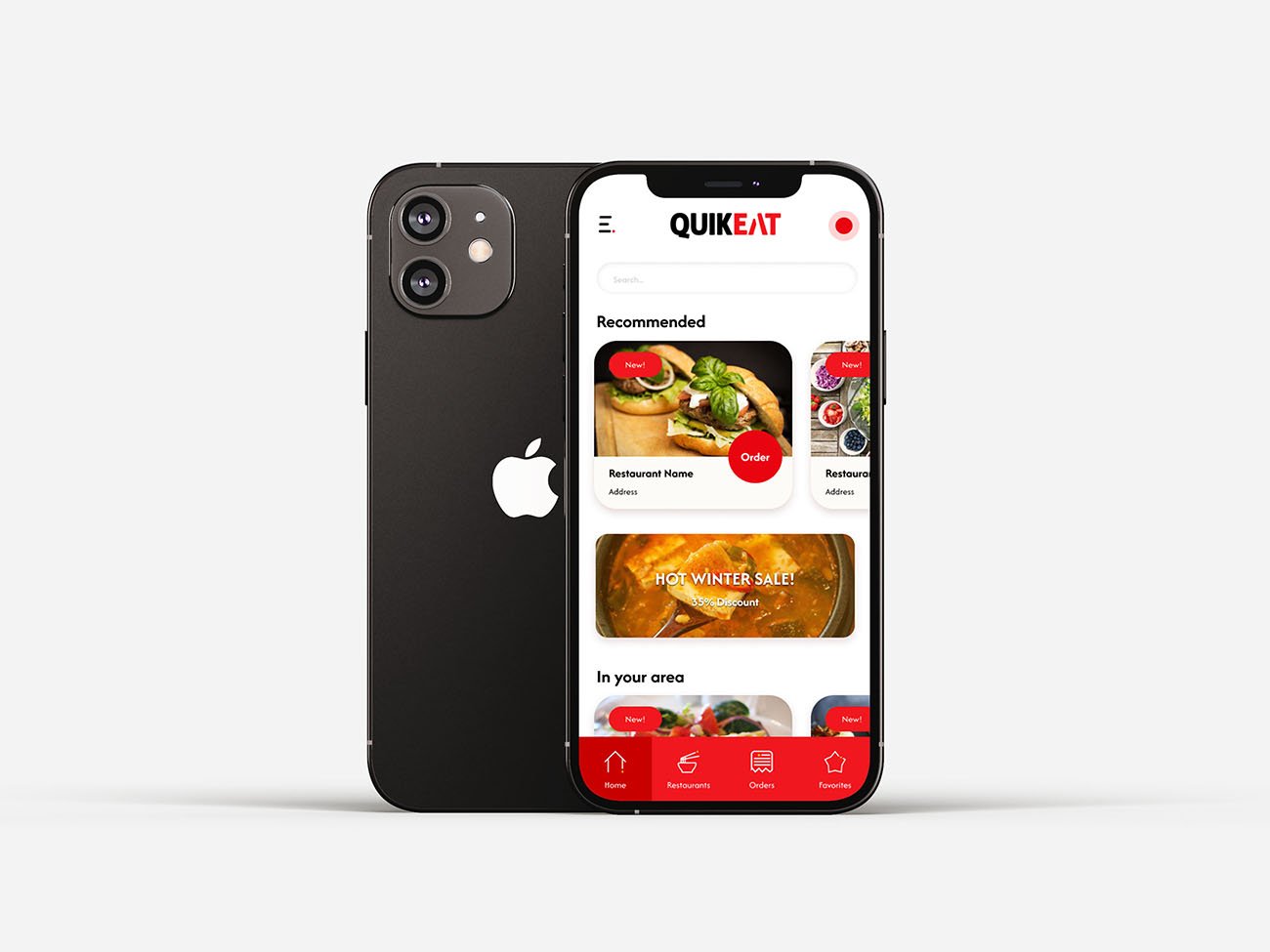
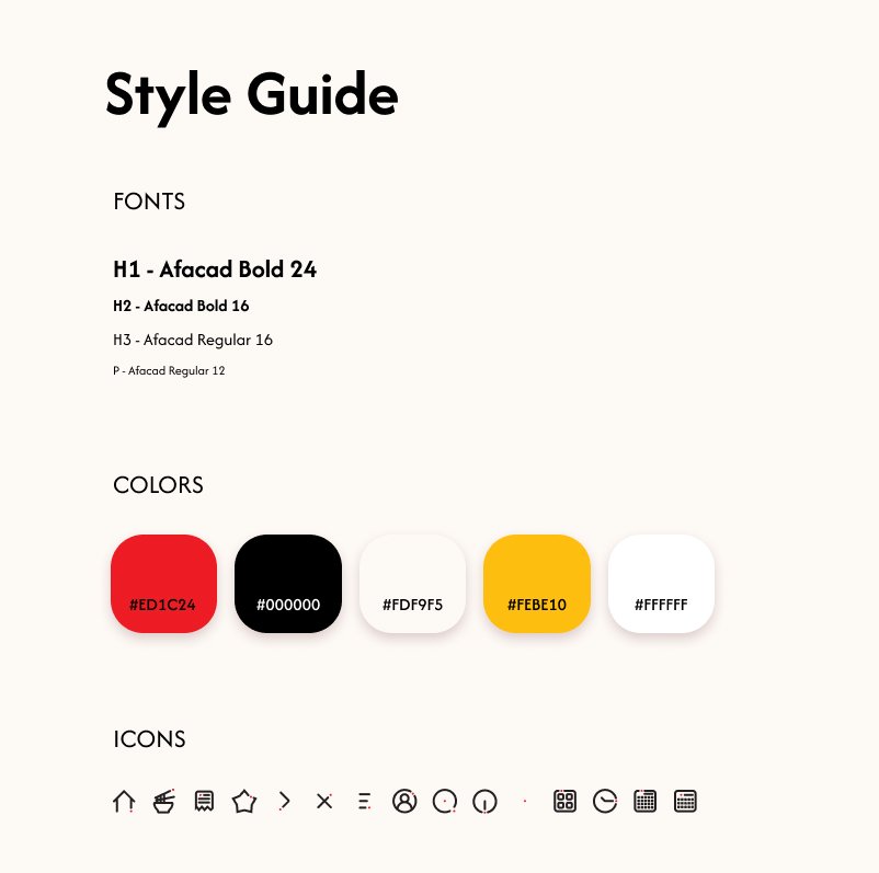
The project included designing the product itself, the system, and the logo for “Quikeat.” The goal was to create a user-friendly and intuitive system that enhances the customer experience and effectively conveys the brand’s values.
Challenge
“Quikeat” needed an intuitive and visually appealing ordering system that could stand out in a competitive market. The challenge was to design a seamless user experience that aligns with the brand’s identity and meets the diverse needs of its users.

Solution
Logo Design
- The logo design started with a deep understanding of user needs and preferences.
- The design process included creating initial sketches and prototypes, which were refined through comprehensive feedback.
- The final logo reflects the brand’s values and helps convey the company’s message effectively.
Ordering System Design
- Designed an intuitive and aesthetically pleasing user experience, ensuring full functionality of the system.
- The system was planned for user convenience, allowing for a smooth and efficient customer experience.
- The design process included detailed drawings and designs of the user interface.

Result
The final outcome was an independent ordering system that provides a smooth and efficient user experience. The system successfully meets its goals and aligns with the predefined expectations and requirements. The branding and design project not only enhanced the user experience but also strengthened Quikeat’s market presence, ensuring a seamless and enjoyable experience for all users.


